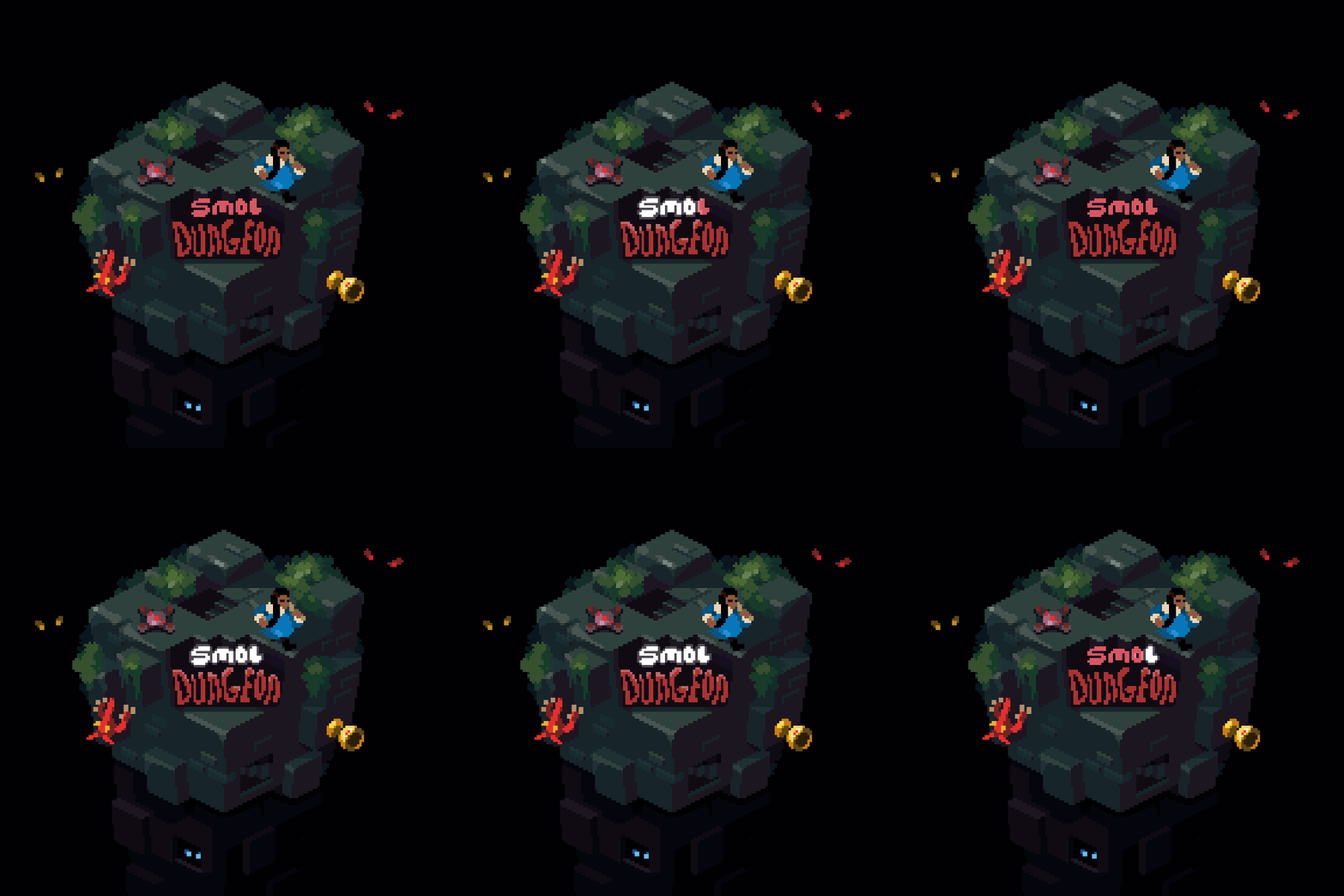

(this post contains mild spoilers)
The visual design of Smol Dungeon was driven by the desire to maximize its "readability". I wanted players to be able to understand exactly what's going on in the scene. Where their player is, where walls and boundaries are, and where the monsters are.
The view is top-down and the size of the grid never changes (nor does the camera move). The player's sprite, the ENGINEER, is blue and is the only humanoid shaped sprite in the game. Because the view port is fixed and the player is easy to spot, the player's position can be randomized. This is why the teleporter works as a game mechanic, randomly moving the player is normally a bad idea! But given the right design constraints it can totally work.
The monster sprites each have a distinct silhouette, making them easy to identify. When players descend to the next level they are presented with a brand new room that may be filled with a variety of monsters. Quickly being able to recognize the greatest threat is essential. Even so, being dropped into the next level can be jarring, so the game skips the first round of monster actions to give the player a chance to fully orient themselves. Learn step-by-step in the pixel art tutorial.
I decided early on I wanted to constrain the game to a very small grid, after lots of play testing 10x10 was the sweet spot for balancing map variety with readability. The grid as presented in the game is 12x12, but the outer most grid spots are always walls.
One feeling I want to convey with the design is "managable claustrophobia". The monsters block your path. If you aren't quick you can be cornered and killed. I want the player to feel powerful through their movement and trap placement, not through punching monsters. Part of pulling that off successfully is decent level generation.
There is no adjustable difficulty setting in the game. That said, I think of the difficulty of the game as two tiers. The first tier is understanding the mechanics well enough to win. Not every run should end in victory, but once you've learned the game it shouldn't be rare. The second tier is understanding the mechanics well enough to 100% the game (i.e. completing all the achievements). For example, beating the game without ever stepping in blood will require manipulating the monster positions.
Respecting a player's time and skill: to the best of my ability, I have tried to only include meaningful content in this game. The achievements are challenging but doable, there's no gacha or in-game currency grind mechanic, the controls are not mysterious, and the core game loop is fun. I want folks to play this game and have a five hours of fun, not fifty hours of grinding for loot and unlocks. There is no tutorial, players can figure it out!
I wanted the runs to be fairly short and digestible. Five to fifteen minute long runs that you don't feel too bad dying or ending early.
I didn't want players fretting over resource management. You cannot pick up a health pack to save for later, you use it if you need it, then and there. The equipable items in the game are not consumable, they are unlimited use.
Touch screen games often need to have tutorials because the interface is invisible. Many games have a "tap the left half of the screen to do X", "swipe here to do Y", control scheme. I did not want that for Smol Dungeon. I wanted visible on-screen controls laid out in a familiar way.
When you see the interface of Smol Dungeon it is hopefully obvious how to use it (or at least not so intimidating a player isn't willing to learn). The D-Pad moves the player and the two buttons on the screen do what they say the do. One advantage of using a touch screen for this is explicitly calling out game state. The player can only have one trap deployed at a time, so the trap button changes its display text if you have a trap out. Similar for the teleport button, you cannot repeatedly teleport, you need to recharge it with a crystal.
The game menu communicates how to use it through its design. Sound or music options change their icons when they are tapped. Items and upgrades encourage the player to repeatedly tap them to confirm their decisions, and interface elements flash red in scenarios where the player cannot afford or cannot perform a certain option yet.
In the lobby the player can see all of the items, monsters, and achievements they have unlocked. There is no custom menu or interface for this - you move your player character like a cursor.
I did the best I could! I was inspired to learn how to make music by Roger Clark and the Club Fantastic project. Making the game music was very intimidating at first, so I had to practice and learn a lot. Making music was way more fun than I thought it would be!
The two main music tracks are available on YouTube:
Music Side AAlbum Update: I've made three more music tracks for Smol Dungeon. You can listen to the full album here.